Alternating between indy books purchased at recent shows and "New 52" debuts from DC. Here's the first issue of the new Batman series.
Title: Batman
Issue: 1
Date: November 2011
Publisher: DC Comics
Writer: Scott Snyder
Penciler: Greg Capullo
Inker: Jonathan Galpion
Colorist: FCO Plascencia
Letterer: Richard Starkings, Comicraft's Jimmy Betancourt
Editor: Katie Kubert, Janelle Asselin, Mike Marts
Cover: Ethan Van Sciver
I bought the (gorgeous) variant cover with artwork by Ethan Van Sciver (pictured above).
Opening introduction references a Gotham Gazette feature where random people complete the sentence "Gotham is _____" in three words or less. It's a really nice introductory reflection as we shift from a montage of Gotham nighttime scenes into the Batman taking on a full-scale riot at Arkham Asylum... With the Joker fighting alongside him!
This is the kind of surprise that I like to see from a new Batman book, and the explanation, when we finally get to it, is at least reasonable. Even better is the Batman's response when Jim Gordon questions him about what he saw in the security footage.
Batman has the trust of Gordon here, and we're in "present" time (as opposed to the "five years ago" setting for Justice League and Action Comics; my reviews are here and here respectively btw). Bruce Wayne is in full playboy socialite mode, but he's got his own plans to save Gotham in his civilian identity as well, and the scenes with Bruce Wayne do a good job of capturing his style and charisma. There's also a brief scene with Bruce and three Robins (Dick Grayson, Damian Wayne, and Tim Drake), and a really amusing bit involving the Batcomputer identifying the security access levels of the various sidekicks and former sidekicks. It's amusing to see who outranks them.
The mode quickly shifts back to gritty as the Batman helps the GCPD investigate a gruesome (and unsubtle) crime scene. Harvey Bullock! Now if we could just get Renee Montoya back. There is a mysterious prediction found at the crime scene, but the really shocking twist comes when the DNA evidence is analyzed and the Batman realizes that he's dealing with a mystery that hits close to home.
This was a really good Batman story, with elements of mystery, good action sequences, and excellent use of the supporting cast. It lays the seeds for several subplots and delivers a satisfying twist at the end.
Rating: 8/10
Friday, September 30, 2011
Wednesday, September 28, 2011
Flutter
Here's my first review of books brought home by my wife from last weekend's Massachusetts Independent Comics Expo in Cambridge MA.
Title: Flutter
Date: 2010
Publisher: Jennie Wood
Writer: Jennie Wood
Artist: Jeff McComsey
Letterer: Jeff McComsey
Standard comic format b/w teaser for the upcoming color graphic novel.
Fifteen-year-old Lily has a bit of an invulnerability problem. She's on the run with her father from some unspecified shady dealings, which probably have something to do with the superpowers that she appears to be manifesting.
She's also developed a crush on a girl at the new school she's attending, and she'd not about to let some gender identity concepts keep her from getting what she wants. Especially since her powers seem to include shapeshifting.
This was fun. It had a lot going on, including some gender politics themes and hints of a pretty complex backstory. Lily's frustration at not being able to experience "normal" sensations of pain comes through loud and clear, and her dialogue flows naturally in both of her identities. Good pacing too. Plenty happened in this issue, but it never felt excessively rushed.
Rating: 7.5/10
Tuesday, September 27, 2011
Men of War #1
DC comics returns to the old tradition of war comics with this series from the "New 52".
Title: Men of War
Issue: 1
Date: November 2011
Publisher: DC Comics
Writer: Ivan Brandon, Jonathan Vankin
Penciler: Tom Derenick, Phil Winslade
Inker: Tom Derenick
Colorist: Matt Wilson, Thomas Chu
Letterer: Rob Leigh
Editor: Kate Stewart, Joey Cavalieri
Cover: Viktor Kalvachev
DC's new war comic features (Corporal at the start of the story, sergeant by the time we're done) Joseph Rock, grandson of the classic Sergeant Rock character. He spends about three pages trading military cliches with his commanding officers as they dance around the issue of how Rock is a good soldier, but keeps disobeying orders, but in a way that always seems to work out in the end. The brass sees leadership potential in Rock, but Rock is content as a grunt. After the discussion fails to reach any kind of meaningful conclusion, we head into the thick of the action.
And not just any action. This is warfare in the superheroic age. The actual superheroes function as artillery. They're destructive, come out of nowhere, are not all that accurately targeted, and cause a ton of collateral damage.
Rock gets himself a battlefield promotion (the hard way), but not a whole lot of plot actually happens.
But wait, there's more. When I bought this comic, I didn't notice the $3.99 price tag until I brought it up to the register. I was a bit surprised that a title that doesn't feature a "hot" character got the higher price point. Apparently we are paying the extra buck for a backup story.
So, the backup story is "Navy Seals: Human Shields". The main thing that struck me was how wordy the dialogue was. I just have a very hard time believing that real soldiers in combat talk this much. And to add to the wordiness we get little translations of military terminology like "rocket propelled grenade" (and here I was thinking they meant Dungeons & Dragons) and "rules of engagement".
The main characters are a Navy Seal odd couple. One of them is a pretty straightforward gung-ho marine type. The other guy is a former Peace Corps volunteer who realized that "If you want to do good, it helps to have an assault rifle." You know, like Gandhi and Jesus used to carry. It doesn't help that the writers don't actually include any real details of the character's Peace Corps service, which might have at least made for some interesting background.
The story itself is clearly trying to highlight the moral ambiguities of war with a scared-looking insurgent girl nervously clutching a Kalashnikov. Of course the real threat is a Bin-Laden looking dude who jumps out to ambush the seals just as they decline to shoot the girl. Stereotyping much?
When this book was originally advertised, there was a mention that the new Sergeant Rock would be a Blackwater-style mercenary, so I'm glad that (so far, at least) there was no sign of that particular plot element. I liked the idea of showing warfare in the age of the superhero, and the point-of-view of the grunt on the ground while a Superman-level character wreaks havoc was impressive.
Unfortunately, the backup story was absolutely horrible. I admire the real-life Navy Seals, but these guys just needed to shut up.
There are a lot of important stories to be told about our armed forces serving in the current wars. They need a comic that does a better job of representing them.
Rating: 5/10
Labels:
2011,
dc comics,
ivan brandon,
joey cavalieri,
jonathan vankin,
kate steward,
matt wilson,
men of war,
phil winslade,
rob leigh,
the new 52,
thomas chu,
tom derenick,
viktor kalvachev
Monday, September 26, 2011
Deathstroke #1
Still more New 52.
Title: Deathstroke
Issue: 1
Date: November 2011
Publisher: DC Comics
Writer: Kyle Higgins
Penciler: Joe Bennett
Inker: Art Thibert
Colorist: Jason Wright
Letterer: Travis Lanham
Editor: Rickey Purdin, Rachel Gluckstern
Cover: Simon Bisley
The problem with having a guy who's supposed to be the "world's greatest tactician" is that it holds the writing to a certain standard. The reader expects to see, well, good tactics.
Not bringing a sword to a gunfight (first scene). Not failing to get proper intel on your enemies (fourth scene). And definitely not letting your emotions goad you into killing your teammates for stupid reasons (last scene). And that applies even if the writer happens to let the supposed "world's greatest tactician" get away with all of the above. It even applies if the aforementioned teammates are annoying.
I know good tactics. This isn't it.
This is bad tactics being covered by even worse writing.
Rating: 3/10
Sunday, September 25, 2011
DC Universe Presents #1
Title: DC Universe Presents
Issue: 1
Date: November 2011
Publisher: DC Comics
By: Paul Jenkins, Bernard Chang
Colorist: Blond
Letterer: Dave Sharpe
Editor: Wil Moss
Cover: Ryan Sook
This is DC's new anthology title, featuring a rotating cast of characters who don't have their own spotlight elsewhere in the "New 52". Popular supernatural hero Deadman is up first, and it look like the plan is to give each featured character a multi-issue arc, probably aiming for trade-paperback length just in case they have a major hit.
This opening story is primarily a recap of Deadman's origin, with some glimpses of some of the people that he has helped since his return to earth in ghostly form. They set this up a lot like Quantum Leap. Boston Brand experiences life as other people (a wounded war veteran and an aging motorcycle stuntman rather blatantly modeled after Evel Knievel). These people, the "living bricks who will pave your way to enlightenment" according goddess Rama (who looks a lot like a Na'vi in a bellydancing outfit), are in need of exactly the kind of help that getting possessed by an outside entity can give.
Brand has an amusing conversation with a former friend, a carnival psychic who seems surprisingly dubious when confronted with an actual supernatural phenomena. The conversation doesn't really go anywhere, however, and Brand returns to trying to help the wounded soldier without the advice he was seeking, and we end on another confrontation with Rama, possibly with the soldier's life on the line.
The basic idea behind this was solid, and it gave a reasonable sense of purpose to the "New 52" version of Boston Brand. The execution, however, was choppy, and by the end I felt that nothing other than the recap of the origin story (which wasn't too far removed from the version I was familiar with) had actually happened.
Rating: 5.5/10
Friday, September 23, 2011
Catwoman #1
After a brief detour for The Great New England Steampunk Exposition, it's back to DC's "New 52". Here's one of this week's releases.
Title: Catwoman
Issue: 1
Date: November 2011
Publisher: DC Comics
Writer: Judd Winick
Artist: Guillem March
Colorist: Tomeu Morey
Letterer: Sal Cipriano
Editor: Rachel Gluckstern, Rickey Purdin
Cover: Guillem March
The most unrealistic scene in this comic is not Selina crashing through an upper-story window and landing unharmed. It's not her dodging bullets, or outfighting overwhelming numbers of trained killers. It's not even Selina seducing the Batman.
The most unrealistic scene in this comic is Selina getting six cats into a single cat carrier in 30 seconds. Sorry, I don't care if she's the Catwoman. I wouldn't care if she had all the powers of Superman, the Flash, Green Lantern, and Darkseid. NOBODY can do that.
That being said, this was a fairly entertaining story. It's definitely a violent story, and it was REALLY pushing the T+ rating, but you know what? That was fine for this book. I know I tend to get annoyed with some of the excesses of comics when it comes to violence, but if any book should be sexy and violent, it's Catwoman.
The story gets off to a running start as Selina gets the type of foreclosure notification that is accompanied by armed thugs and explosives. So she's broke and out on the streets. That's the motivation. Fortunately she's got her own personal "Oracle", a fence named Lola ("...and she actually was a showgirl." Ha!). I liked Lola. She's attractive, but still more realistically drawn than pretty much every woman in the new DCU (Apparently including Amanda Waller! WTF? Actually, don't get me started. That one gets its ownreview rant).
Lola sets up Selina with a gig bartending at a Russian mob party. Actually, she just supplies the address of the party. Selina helps herself to the gig using the time-honored tradition of rendering the bartender unconscious and stealing her clothing (Yay! Oh, wait, the scene takes place off-screen... Boo!). Selina takes time out from scouting her next heist to inflict some payback on a bad guy in need of payback. Brawl follows.
And then there's a sex scene with the Batman. All of which leads us full circle back to the genuinely hilarious title of this story, "And most of the costumes stay on..." Ha!
Okay, this was not exactly a literary masterpiece, but it was fun, and everything in the story worked well. I'd rather have the raunch factor cranked up in this book than have it be the standard for the whole "New 52". Here it works.
Rating: 7/10
Title: Catwoman
Issue: 1
Date: November 2011
Publisher: DC Comics
Writer: Judd Winick
Artist: Guillem March
Colorist: Tomeu Morey
Letterer: Sal Cipriano
Editor: Rachel Gluckstern, Rickey Purdin
Cover: Guillem March
The most unrealistic scene in this comic is not Selina crashing through an upper-story window and landing unharmed. It's not her dodging bullets, or outfighting overwhelming numbers of trained killers. It's not even Selina seducing the Batman.
The most unrealistic scene in this comic is Selina getting six cats into a single cat carrier in 30 seconds. Sorry, I don't care if she's the Catwoman. I wouldn't care if she had all the powers of Superman, the Flash, Green Lantern, and Darkseid. NOBODY can do that.
That being said, this was a fairly entertaining story. It's definitely a violent story, and it was REALLY pushing the T+ rating, but you know what? That was fine for this book. I know I tend to get annoyed with some of the excesses of comics when it comes to violence, but if any book should be sexy and violent, it's Catwoman.
The story gets off to a running start as Selina gets the type of foreclosure notification that is accompanied by armed thugs and explosives. So she's broke and out on the streets. That's the motivation. Fortunately she's got her own personal "Oracle", a fence named Lola ("...and she actually was a showgirl." Ha!). I liked Lola. She's attractive, but still more realistically drawn than pretty much every woman in the new DCU (Apparently including Amanda Waller! WTF? Actually, don't get me started. That one gets its own
Lola sets up Selina with a gig bartending at a Russian mob party. Actually, she just supplies the address of the party. Selina helps herself to the gig using the time-honored tradition of rendering the bartender unconscious and stealing her clothing (Yay! Oh, wait, the scene takes place off-screen... Boo!). Selina takes time out from scouting her next heist to inflict some payback on a bad guy in need of payback. Brawl follows.
And then there's a sex scene with the Batman. All of which leads us full circle back to the genuinely hilarious title of this story, "And most of the costumes stay on..." Ha!
Okay, this was not exactly a literary masterpiece, but it was fun, and everything in the story worked well. I'd rather have the raunch factor cranked up in this book than have it be the standard for the whole "New 52". Here it works.
Rating: 7/10
Monday, September 19, 2011
Girl Genius Volume 2: Agatha Heterodyne and the Airship City
This was my only purchase at this weekend's Great New England Steampunk Exposition.
Title: Girl Genius Volume 2: Agatha Heterodyne and the Airship City
Date: 2010
Publisher: Airship Entertainment
Writer: Kaja Foglio, Phil Foglio
Penciler: Phil Foglio
Colorist: Mark McNabb
This is the second volume collection the webcomic by Phil and Kaja Foglio.
Former student Agatha Clay awakens aboard Baron Wulfenbach's airship city following an incident involving an out-of-control clank (robot). A rogue soldier named Von Zinzer is assumed to be the creator of the clank, and therefore possessing of the spark of mad science. Now he needs Agatha to help him keep up the charade long enough to find a way out of the airship city.
The plot really thickens from here. As I mentioned in a review I did of the first volume (this review predates this blog), Agatha herself doesn't get much of the spotlight in the beginning. That is quickly fixed here, and the character is really allowed to shine.
Girl Genius is primarily a comedy, but it's an adventure-comedy with an excellent plot and some really important issues underlying the slapstick jokes. This volume also introduced an excellent array of supporting characters and a bunch of subplots.
Phil Foglio's art style is a distinctive mix of cartoony characters and action sequences with some spectacularly detailed renderings of machinery and backgrounds. The two-page spread that revealed the airship city was simply awesome.
This volume took a series that was already quite good and kicked it into high gear. But don't take my word for it. The whole series is available as a free webcomic. Go to www.girlgenius.net.
Rating: 8.5/10
Saturday, September 17, 2011
Green Arrow #1
More from DC's "New 52".
Title: Green Arrow
Issue: 1
Date: November 2011
Publisher: DC Comics
Writer: J. T. Krul
Penciler: Dan Jurgens
Inker: George Perez
Colorist: David Baron
Letterer: Rob Leigh
Editor: Sean Mackiewicz, Pat McCallum
Cover: Dave Wilkins
Oliver Queen gets one of the biggest makeovers in the "New 52". He's the owner of a tech corporation now, a fairly blatant ripoff of Apple (there's even a Q-Pad *sigh*). So I guess they're not so much making Ollie into Steve Jobs. They're making him into Tony Stark.
Ollie skips board meetings to travel the world hunting down (third-rate, so far) super-villains. In this case he takes on Dynamix, Doppelganger, and Supercharge in what is essentially an extended jobber squash. Ollie barely breaks a sweat as he dismantles this crew of idiots with an array of trick arrows, plus a few of the old-fashioned pointy kind. Sadly, no boxing-glove arrow, though. No Phantom Zone arrow either. That was a classic one they need to bring back sometime. But really, just one use of the boxing-glove arrow for old-times sake is all I ask!
Ollie has a support team that consist of a woman named Naomi, who is basically a poor imitation of Oracle just by the fact that she is not Barbara Gordon. She seems to wish she was on the support team of someone with fewer scruples about just blowing the bad guys up. Maybe Frank Castle is hiring?
There is also a guy named Jax who reluctantly designs weapons, and he's the best character in the book so far. Which means he'll probably get killed off around issue 3.
Ollie gets in some good lines as he lectures the villains while administering a beatdown. The experienced team of Jurgens and Perez does a great job with the art, and the action is fast-paced without losing attention to detail.
This is one of the more radical departures for a classic character that we've seen in the "New 52", and I had a bit of a hard time reconciling this corporate version of Ollie with the fight-the-power aging hippie version from earlier series. I did think this version was a huge improvement over the (awful) "corporate" version of Ollie presented in one of the Flashpoint crossovers. This character is at least competent and heroic.
Dinah is also conspicuous in her absence, and I'm hoping they have plans to get her involved somehow.
But this is an enjoyable, entertaining superhero book, and the series definitely hit the ground running.
Rating: 6.5/10
Friday, September 16, 2011
Animal Man #1
Another character that spent some time as a Vertigo book. Now back in the main DCU for the "New 52".
Title: Animal Man
Issue: 1
Date: November 2011
Publisher: DC Comics
Writer: Jeff Lemire
Penciler: Travel Foreman
Inker: Travel Foreman, Dan Green
Colorist: Lovern Kindzierski
Letterer: Jared K. Fletcher
Editor: Kate Stewart, Joey Cavalieri
Cover: Travel Foreman
Clever opening with a first-page text feature that is a magazine interview with actor, animal rights activist, and semi-retired superhero Buddy Baker. Buddy isn't really sure what to do with himself, and the pressures to provide for his family are beginning to mount.
When he stops a distraught hostage-taker at a hospital, Buddy gets his first hint that something is not right in the morphogenic field that is the source of his powers.
The focus soon shifts to Buddy's daughter, Maxine, who really wants a pet puppy. Someone should have played the old song "dead puppies aren't much fun" for her.
There's also a very surreal (and pretty effective) dream sequence in here.
Horror, check. Family drama, check. Something weird going on with Maxine, check. Surrealism and bizarre dreams, check.
Yeah, this is an Animal Man book. It is, in fact, THE typical Animal Man story from the Vertigo run, and it left me with quite a bit of deja vu. I'm guessing this was a conscious decision, made to introduce new readers to they type of story that longtime fans expect from this title. While not all that new or original, it was handled well from start to finish.
Buddy Baker works really well as a sort of liberal "everyman" character. He's an environmentalist and a vegan, and he's got a complex family situation to juggle. And he's basically a well-intentioned nice guy. A lot of readers will relate to him (even readers who don't agree with him on his choice of a vegan lifestyle). It's hard not to relate to him.
The story moved along at a good pace and planted plenty of seeds for future action. It also had some creepy moments and a disturbing ending.
I would have liked some more originality, but this provided a good starting point.
Rating: 7/10
Thursday, September 15, 2011
Batwing #1
Another book from the first week of DC's "New 52".
Title: Batwing
Issue: 1
Date: November 2011
Publisher: DC Comics
Writer: Judd Winick
Artist: Ben Oliver
Colorist: Brian Reber
Letterer: Carlos M. Mangual
Editor: Mike Marts, Rickey Purdin
Cover: Ben Oliver, Brian Reber
The "Batman of Africa" is David Zavimbe, an police officer in the city of Tinasha in the Democratic Republic of the Congo. He's a by-the-books detective who prefers to solve crimes from behind his desk, but of course, that's a front for his activities as Batwing.
We open in the midst of a fight scene between Batwing and a guy named Massacre. Because the name "Genocide" was apparently already taken. One of these days, DC Comics are going to run out of synonyms for "mass murder", and then they're probably just start assigning numbers to their villains. Or maybe use the Greek alphabet or something.
We leave the fight scene for an extended flashback that takes up most of the issue. The Batman makes a guest appearance, and some of the other supporting cast is introduced. A mystery involving the original African superhero team (The Kingdom) begins to unravel, just in time for Zavimbe to find Massacre (at the site of a... wait for it... massacre!).
This was good in terms of pacing, and action, and the establishment of Zavimbe as a new apprentice to the Batman was interesting.
But I found the overall flavor of the book to be disappointing. I learned nothing about African society and culture reading this. I realize that this is an action comic book, not a sociology text, and I also realize that there is an attempt here to be realistic about a part of the world that really is recovering from an extended period of horrible internal warfare. I realize that corruption in government and law enforcement is a huge issue.
But depicting an entire police force that cares only about where the next bribe is coming from (except for the hero and one female officer/potential-love-interest who is beginning to see the light), is not being realistic. It's playing to stereotypes. Couple that with the fact that all the characters who appear in this issue are either 1) part of the hero's team, 2) the aforementioned "female-cop-with-potential-heart-of-gold", 3) murderous thugs, or 4) The Batman, and you've got a book that is failing to do justice to its setting. And when you set a book in Africa, doing justice to the setting should be a top priority.
I think I need to see what it was that Zavimbe felt was worth fighting for.
What I didn't need to see was an ending the loaded up on the gore just for the sake of convincing us that the villain was a bad guy, before getting to a "shocking" finish that was mostly shocking in the sense that it left me wondering how the writer intends to write out of the corner he wrote himself into.
As a generic (violent) superhero story, this was not bad. As with the new Batgirl (my review is here), I expected a lot more out of this book, given what it is attempting to do.
The first issue failed to live up to those expectations.
Rating: 4.5/10
Wednesday, September 14, 2011
Swamp Thing #1
More New 52. Here's one of DC's classic horror characters.
Title: Swamp Thing
Issue: 1
Date: November 2011
Publisher: DC Comics
Writer: Scott Snyder
Artist: Yanick Paquette
Colorist: Nathan Fairbairn
Letterer: John J. Hill
Editor: Matt Idelson, Chris Conroy
Cover: Yanick Paquette, Nathan Fairbairn
Alec Holland has woken up in his human form with only faint dreamlike memories of three years as the Swamp Thing. He's quit his job as a researcher and tried his best to disappear. But you can't hide from nature. Or should that be you can't hide from YOUR nature. Both statements would seem to apply.
A fair portion of this issue is a conversation between Holland and Superman, who is investigating a series of strange mass animal fatalities. Oddly, Superman as depicted here is nothing like the Superman who was introduced in the debut of the new Action Comics (my review is here). They very much went for the traditional Superman persona for this story, which I believe is set five years ahead of Action Comics in the continuity. I would have liked to have seen at least a nod to the new version here. Sure, maybe that five years is all the maturing that Clark needed to be back to the Lawful-Good, 18-Wisdom version of Superman that we typically got before the relaunch, but my gut reaction was that this was a big inconsistency. And it seems like the kind of thing that would be easy to avoid, given the planning that went into the relaunch.
Once Supes leaves the scene, we very quickly exit superhero-mode and enter horror-mode, which usually works better for the Swamp Thing character. We just get a quick scene with the new villain that, while is explains nothing, is imaginative and definitely disturbing.
The Swamp Thing himself only appears in the ending cliffhanger, but the build-up to that scene is nice.
Aside from the issue I had with Superman (and the scene itself was good), this was really solid. It had the philosophical musings and the horror elements that we expect from Swamp Thing, and it did a nice job of building the tension up.
Rating: 7.5/10
Monday, September 12, 2011
Static Shock #1
Before we get started, let me point you in the direction of The Pull List, a new review blog by writer/artist Joe McGlone. With the "New 52" going on at DC, we're going to be reviewing a lot of the same books, so go check out The Pull List for another opinion on some of these new titles. Joe's also got a webcomic called Entripor that's definitely worth a look.
Title: Static Shock
Issue: 1
Date: November 2011
Publisher: DC Comics
Writer: Scott McDaniel, John Rozum
Penciler: Scott McDaniel
Inker: Jonathan Glapion, Le Beau Underwood
Colorist: Guy Major
Letterer: Dezi Sienty
Editor: Harvey Richards
Cover: Scott McDaniel, Guy Major
Remember when superhero comics were, you know, fun? Well, take my word for it, there was a time where it wasn't just blood, gore, and a new universe-threatening crisis every month.
This book is a trip back to those times, and it's the best thing I've read so far in the DC Comics relaunch. Not because it touches on any deep philosophical issues or because it delivers shocking twists or somehow "deconstructs" the mythology of comics.
Because the characters are likable and the book is fun.
Super-powered teenager Static AKA Virgil Ovid Hawkins has arrived in New York City fresh from Dakota (and the universe of Milestone Comics). He's got an after-school gig at STAR Labs and he's already on the trail of some kind of sabotage plot. And a team of super-powered thieves are very unhappy to see Static poking his nose into their business.
Story has excellent pacing, a solid supporting cast, and a reasonable portrayal of a teenage hero who's not a complete loser when it comes to life in his secret identity, but who's got a good mix of teenage problems and superhero problems to deal with. I loved Static's confidence, and his touch of wit. Yes, the character is basically Peter Parker, but that's not a terribly bad model to follow. And it's been a long time since Peter Parker was actually a teenager.
Static's powers are also fun. There's a ton of technobabble, but it's at least reasonable enough that it doesn't detract from the story, and Static even tosses around some postitve/negative puns.
This is definitely light fare compared to books like Detective (my review here), Batgirl (here), and even Action (here). In fact, I actually think the plot would have worked even better without the one murder that occurred. There's room for a comic that doesn't pile up the body count. I'd love to see DC embrace that with this book.
Rating: 7.5/10
Sunday, September 11, 2011
Batgirl #1
More New 52 from DC. Probably the most controversial book in the new lineup.
Title: Batgirl
Issue: 1
Date: November 2011
Publisher: DC Comics
Writer: Gail Simone
Penciler: Adrian Syaf
Inker: Vincente Cifuentes
Colorist: Ulises Arreola
Letterer: Dave Sharpe
Editor: Katie Kubert, Bobbie Chase
Cover: Adam Hughes
A villain called Mirror is going around killing people who miraculously survived deadly peril. It's a lot like those Final Destination movies except that instead of Death being after the survivors, it's just some (admittedly really dangerous) dude. He kills them by the same fate they escaped, so the lone survivor of a shipwreck gets drowned. Oh, and he's got Barbara Gordon on his list.
Speaking of which, we're rebooting Barbara Gordon.
Before I get into some of the (huge) controversy surrounding this book, let me mention that the art here was great, especially on the fight scenes, which were creative and fun. The supporting cast was solid, and I liked the villain. He's genuinely scary without being ridiculously unbelievable. Oh, and the bit where the victims that Barbara saves mistake her for Batwoman? HA! Nice!
That being said...
This comic has opened a huge can of worms that involves all sorts of issues around advocates for people with disabilities and so on. As Oracle, Barbara Gordon was something really unique. A character who lives with a paralyzing spinal injury and is still a capable superhero. The Oracle character has been consistently one of the best-written characters in DC comics over the last 20 years or so, so it's understandable that people have been a bit leery over simply giving Barbara Gordon the use of her legs back and having her go back to being Batgirl.
There was also a lot of speculation about how exactly that would be handled. Would she be healed? Would she be using some kind of bionics or other science fiction plot device? Or would they just change history so the whole shooting by the Joker never happened?
(I usually don't bother with spoiler warnings in these reviews, but what follows is pretty major...)
SPOILERS
Essentially, they took the retcon route here, but left the shooting and the ensuing paralysis in the continuity. They made it temporary. Barbara was in the wheelchair for three years, but gradually regained the use of her legs. She's back in shape (with, as she puts it "upper arm strength like a mother" after the time in the chair) and ready to return to her Batgirl gig.
Or is she? She handily takes out a group of thrillseeking home-invaders (as per the film The Strangers). But she's having doubts all the way through (thanks to convenient captions). And in her first confrontation with Mirror, she freezes up at the sight of a gun.
That was pretty much where this book lost me.
I get it. Getting shot, paralyzed for three years, unsure if you'd ever walk again, your father tortured (by the Joker, no less!). That has got to leave some serious PTSD. Makes sense.
Still, absolutely horrible idea to play up in the reboot of this character. Barbara Gordon was nothing but strength as Oracle. She was awesome because of what she overcame. And now, she's letting someone die because she freaks out? I buy it on a logical level, but my heart's not in it.
And you know what? I have some serious doubts that they'd go this route with a male character in the same set of circumstances.
I've read some great stuff by Gail Simone, and I understand that the point of this is that Barbara overcomes these issues. Got it. But like many fans, I was really dubious about the change from Oracle back to Batgirl.
This isn't the way I was hoping it would be handled. And I would guess I'm not alone in thinking that.
Big disappointment.
Rating: 4.5/10
Saturday, September 10, 2011
Detective Comics #1
As you may have noticed, I've been doing some new mainstream releases recently. While I'm not going to review every issue #1 from DC's "New 52", I've been taking advantage of the ongoing buy-3-get-one-free deal at Newbury Comics to sample some of the new offerings that interest me. This will continue through the month of September, at which point I'll be turning my attention to books that I pick up at Fall conventions I attend, as well as getting back to the ever-present backlog.
Title: Detective Comics
Issue: 1
Date: November 2011
Publisher: DC Comics
Writer: Tony Salvador Daniel
Penciler: Tony Salvador Daniel
Inker: Ryan Winn
Colorist: Tomeu Morey
Letterer: Jared K. Fletcher
Editor: Katie Kubert, Janelle Asselin, Mike Marts
Cover: Tony Salvador Daniel
The original run of Detective Comics started in 1937, with the Batman's debut in issue #27 two years later. It ran 881 issues and holds the record for the longest continuously published comic book in the US (although Action Comics reached a higher issue number before DC's relaunch due to periods where it was published more frequently than Detective).
Unlike the Superman reboot in Action Comics, this book gives us classic Batman as we've come to expect him. In fact, I'd describe this story as a perfectly typical Batman vs. Joker tale from the modern era of Batman.
The Batman has been tracking the Joker, and he's located his quarry in a squalid hotel room, where a man in surgical garb menaces the Joker with a knife, but the Joker quickly turns the tables on the man in bloody fashion. The usual mayhem follows, and the Joker escapes when the Batman must save an innocent life and then finds himself pursued by the GPD.
But all is not as it appears. Writer Tony Salvador Daniel is clearly planning some major plot twists here, and he lays the groundwork pretty nicely. There are clues that the Batman (and the reader) are picking up on that there is more to the Joker's latest scheme than meets the eye.
We get a second Batman/Joker battle later in the issue, and then a pretty nasty gross-out scene for the surprise ending (which actually was pretty shocking, but made at least some degree of sense upon a second read of some of the key earlier scenes). I had mixed feelings on this ending because it was highly unrealistic, and it seemed to be going for gross just for the sake of gross. But it was reasonably set up, so if you're willing to buy into the plot twist, there could be an entertaining ride ahead in this series.
Aside from the ending, the main problem I had with the book is that we've seen an awful lot of Batman vs. Joker stories over the past few years, and this one didn't really do too much to stand out. It was good, most of the book was nothing exceptional.
Rating: 6.5/10
Thursday, September 8, 2011
Action Comics #1
Title: Action Comics
Issue: 1
Date: November 2011
Publisher: DC Comics
Writer: Grant Morrison
Penciler: Rags Morales
Inker: Rick Bryant
Colorist: Brad Anderson
Letterer: Patrick Brosseau
Editor: Wil Moss, Matt Idelson
Cover: Jim Lee, Scott Williams, Alex Sinclair
The first Action Comics #1 since 1938! I'm still disappointed that the series won't go to #1000, but as I've mentioned before I understand how DC felt that the renumbering would only be seen as a true relaunch if they renumbered all their titles, including the "big number" books like Action and Detective.
I bought the variant cover version with Jim Lee's artwork, which is actually taken from a (really good) splash page in Justice League #1 (my review of that issue is here).
What we have here is a new take on Superman. He's younger, and clearly inexperienced. He's also got a solid case of cynicism for the legal system, and a cocky and arrogant attitude, particularly toward the Metropolis Police Department. Detective Blake: "We used to have laws in this town. Like gravity." Ha!
The opening scene has him pulling a Batman-style stunt of dropping a white-collar criminal off of building ledge and catching him just before impact to force a (clearly inadmissible!) confession.
Superman's powers have also been scaled back considerably. He's a lot more vulnerable to harm (although still tough enough to take a shot from a tank's main gun).
As for villains, we've got a decent (and pretty much by-the-book) portrayal of Lex Luthor working as a consultant for General Lane (Lois' father). Oh, and the other major adversary in this issue is a bullet train (emphasis on "bullet").
A lot of people probably won't like Superman's new cocky attitude. I didn't think I would. But I did find myself enjoying this portrayal of the character, particularly if the direction we're going in is toward a some growth and maturing. The villains were spot-on (bonus points for Luthor's reference to the brown tree snake and the cane toad!). I liked Clark's interaction with his landlady, who seems like a good supporting character, and I liked his vibe with Jimmy Olsen. There was also a fun scene where some bystanders came to Superman's aid against the military.
The ending sequence was visually pretty cool, but I was a bit lost on the logic behind the scene, which involved a bomb on a train for no reason that I could figure out. It looked like this was a case of trying to fit too much material into a limited number of pages. Something had to get rushed. The ending cliffhanger was still pretty effective, with an great visual.
Rating: 7/10
Labels:
action comics,
alex sinclair,
brad anderson,
dc comics,
grant morrison,
jim lee,
matt idelson,
patrick brosseau,
rags morales,
rick bryant,
scott williams,
superman,
the new 52,
wil moss
Wednesday, September 7, 2011
Green Arrow Industries #1
Title: Green Arrow Industries
Issue: 1
Date: August 2011
Publisher: DC Comics
Writer: Pornsak Pichetshote
Penciler: Marco Castiello, Ig Guara
Inker: Vincenzo Acunzo, Ruy Jose
Colorist: Stefani Renee
Letterer: Carlos M. Mangual
Editor: Kate Stewart, Joey Cavalieri
This is a Flashpoint crossover, so cue Donkey saying "This must be one of those alternate universes!"
In this particular piece of the Flashpoint universe, Oliver Queen is, well, actually he's Tony Stark. But a lot less competent. His company, Green Arrow Industries, manufactures weapons for the US Government. Except instead of doing their own research and development, they've hit upon the perfect source of new technology: Super-villains. After all, what is some random super-powered criminal going to do when Green Arrow Industries steals their gadget? Take them to court?
Of course there is the little problem that this practice tends to make Oliver a lot of enemies.
This is not an absolutely horrible setup. Which is a good thing, because the rest of the comic is, indeed, absolutely horrible.
After introducing the aforementioned scenario, we get a brief scene where security chief Roy Harper urges Oliver to use his corporate assets for good. One panel later Roy is dead (Now that death is one I would consider speedy! *ducks* Sorry, couldn't resist.).
Anyway, there are assassins loose on the premises. Actually just one assassin. The security teams and the rest of the assassins have all killed each other in a bloody battle that took place entirely off-screen. The one remaining assassin is escaping, and instead of just sitting tight and waiting for his backup to arrive, Oliver decides to go after her. He briefly considers bringing a bow that he just happened to be carrying around for no real reason, and then decides that he'd be better off arming himself with an entire rogues' gallery worth of supervillain gear. For some reason, the writer decided to make the fact that Oliver is incompetent with a bow in this universe into a running joke.
Turns out, he's actually just incompetent in general.
So he fights it out with this assassin-girl (who's armed with a bow, of course), and in between fighting they argue over various misdeeds done by Oliver's corporation, until the whole thing finally comes to a rather nasty conclusion that pretty much renders the whole story meaningless.
So, to recap, Oliver is incompetent and a jerk. Assassin-girl is a generic anti-corporate crusader whose surprising connection to Oliver is about as obvious as could be, and Roy Harper actually seems like he's got an interesting personality but is killed off on page five. Also, Harper was in charge of security when all of this went down, so he's not exactly scoring high on the competency scale either.
And the "intriguing" question posed here is the question of whether a corporation can function as a superhero, which buys a bit too into the whole corporate personhood concept for my tastes.
As I mentioned in my previous review, the basic problem with an alternate universe story like Flashpoint is that there is no real reason for the reader to care about the characters. The reader has no emotional investment in this version of Oliver Queen and Roy Harper because we all know that this is a temporary version and that the whole DC Universe is about to get reset.
The only way to win the reader over is with compelling stories and characters that are interesting and appealing enough to make the reader care.
This comic had neither.
Rating: 2.5/10
Tuesday, September 6, 2011
Andy Capp Strikes Back
A recent yard sale find.
Title: Andy Capp Strikes Back
Date: 1967
Publisher: Fawcett Gold Medal
Writer: Reg Smythe
Artist: Reg Smythe
This is a 1967 paperback, reprinting Andy Capp comic strips from the London Daily Mirror. My grandfather was a big Capp fan back when he used to take his daily walk up to the corner for the newspaper.
For those not familiar with the strip, the setup is pretty straightforward. Andy is a lazy drunk who tries to get by mooching what he can off of his long-suffering wife. Andy is of the same archetype that gave us every other lazy male chauvinist character from Fred Flintstone to Al Bundy.
Andy dodges the rent collectors, sneaks out to the pub at every opportunity, and has the occasional run-in with the law. He's not a complete loser: He's a pretty competent footballer (aside from the occasional own goal) and handles himself quite well in brawls.
This was probably fairly edgy stuff in the 1960s, but it has more of a ring of nostalgia when read today. Much of that nostalgia is pleasant, but it does get uncomfortable in a few sequences when Andy's treatment of his wife shifts from verbal jabs to physical abuse. The fact that Andy is often on the receiving end isn't enough to erase the cringe factor, nor does the idea that this is simply a product of its times. Those particular jokes are simply not funny in today's world.
There are only a few such moments in this book, and there were a fair number of jokes that I did find funny. But it didn't make for entirely comfortable reading.
Rating: 4/10
Note: I've got this volume up for sale on Ebay here.
Monday, September 5, 2011
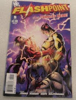
Flashpoint #5
Title: Flashpoint
Issue: 5
Date: October 2011
Publisher: DC Comics
Writer: Geoff Johns
Penciler: Andy Kubert
Inker: Sandra Hope, Jesse Delperdang
Colorist: Alex Sinclair
Letterer: Nick J. Napolitano
Editor: Eddie Berganza, Rex Ogle
Cover: Andy Kubert, Sandra Hope, Alex Sinclair
Disclaimer: I didn't read any other issues of this series. But, having read this one and skimmed the Wikipedia Page, I don't really feel like I needed to.
In the midst of a whole bunch of mayhem, Zoom confronts Flash and restores Barry's lost memories by "resetting your internal vibrations". Apparently this is extremely painful. Probably because the human brain has a limited tolerance for horribly contrived pseudoscientific nonsense.
It is then revealed that...
SPOILER WARNING
The entire Flashpoint miniseries is nothing more than a good old fashioned time travel story about how you can't just go an change the past because all kinds of unforeseen stuff will happen. That's all there is to it.
Five issues. Sixteen different miniseries. A whole bunch of one-shots. And a map of Africa featuring the words "Ape Controlled" (Really, DC? Really?).
And the whole point was to tell the same story about what happens if you go back in time andstep on a butterfly kill Hitler save your mom from a supervillain that every SF author since HG Wells has been telling.
So, in terms of the actual explanation it was a bit underwhelming.
The big climactic battle suffered from the same problem that the big climactic battles in these crossover series always suffer from: Too many characters need to get their big final resolution scenes. The result is a series of quick deaths with no emotional impact (and even less in this series because of the "Elseworlds" nature of the whole thing and the looming DC Universe reboot that will restore most of these characters).
That being said, Zoom gets a pretty good comeuppance that works well in the context of the story and delivers some satisfying impact. And the story does get quite a bit better once we enter epilogue mode and have dispensed with the mass battle stuff. The resolution of affairs between Barry and his mom is a nice touch and the fact that she goes knowingly to her fate is an interesting choice of plot direction. Likewise the final scene with Barry and Bruce Wayne is excellent and it gets a full seven pages.
The actual "reset the timeline" bit was a full two-page spread featuring some hooded woman who I probably should recognize but don't explaining (non-explaining, really) that there were three timelines because the "history of heroes" was shattered, and that they will now merge into one. Okay. This will probably make sense to some of the serious DC fanboys. For people like me, they kept it short and provided lots of random pictures of different version of DC superheroes in the background.
The problem I had with this series in general is that nothing in it really matters. Everyone knew going in that the reset button was going to get hit. Like most time travel stories, the final goal is simply to put the universe back to what it was before (or in this case a very slightly altered version to coincide with the relaunch). So there's no real emotional investment in the end result, nor are there any real stakes being decided while we're in Elseworlds mode. Or, to use Marvel's terminology, this entire series was a huge "What If?" story. And the appeal of "What If?" is to give us a glimpse of an altered version of the world. The altered version presented in this series was nasty, brutish, and ultimately uninteresting.
Given the limitations of what DC set out to do, I'm actually surprised that this final issue had anything worth reading in it at all. It did, and that's something at least. But I'm not exactly regretting not reading the rest of this mess.
Rating: 5.5/10
Issue: 5
Date: October 2011
Publisher: DC Comics
Writer: Geoff Johns
Penciler: Andy Kubert
Inker: Sandra Hope, Jesse Delperdang
Colorist: Alex Sinclair
Letterer: Nick J. Napolitano
Editor: Eddie Berganza, Rex Ogle
Cover: Andy Kubert, Sandra Hope, Alex Sinclair
Disclaimer: I didn't read any other issues of this series. But, having read this one and skimmed the Wikipedia Page, I don't really feel like I needed to.
In the midst of a whole bunch of mayhem, Zoom confronts Flash and restores Barry's lost memories by "resetting your internal vibrations". Apparently this is extremely painful. Probably because the human brain has a limited tolerance for horribly contrived pseudoscientific nonsense.
It is then revealed that...
SPOILER WARNING
The entire Flashpoint miniseries is nothing more than a good old fashioned time travel story about how you can't just go an change the past because all kinds of unforeseen stuff will happen. That's all there is to it.
Five issues. Sixteen different miniseries. A whole bunch of one-shots. And a map of Africa featuring the words "Ape Controlled" (Really, DC? Really?).
And the whole point was to tell the same story about what happens if you go back in time and
So, in terms of the actual explanation it was a bit underwhelming.
The big climactic battle suffered from the same problem that the big climactic battles in these crossover series always suffer from: Too many characters need to get their big final resolution scenes. The result is a series of quick deaths with no emotional impact (and even less in this series because of the "Elseworlds" nature of the whole thing and the looming DC Universe reboot that will restore most of these characters).
That being said, Zoom gets a pretty good comeuppance that works well in the context of the story and delivers some satisfying impact. And the story does get quite a bit better once we enter epilogue mode and have dispensed with the mass battle stuff. The resolution of affairs between Barry and his mom is a nice touch and the fact that she goes knowingly to her fate is an interesting choice of plot direction. Likewise the final scene with Barry and Bruce Wayne is excellent and it gets a full seven pages.
The actual "reset the timeline" bit was a full two-page spread featuring some hooded woman who I probably should recognize but don't explaining (non-explaining, really) that there were three timelines because the "history of heroes" was shattered, and that they will now merge into one. Okay. This will probably make sense to some of the serious DC fanboys. For people like me, they kept it short and provided lots of random pictures of different version of DC superheroes in the background.
The problem I had with this series in general is that nothing in it really matters. Everyone knew going in that the reset button was going to get hit. Like most time travel stories, the final goal is simply to put the universe back to what it was before (or in this case a very slightly altered version to coincide with the relaunch). So there's no real emotional investment in the end result, nor are there any real stakes being decided while we're in Elseworlds mode. Or, to use Marvel's terminology, this entire series was a huge "What If?" story. And the appeal of "What If?" is to give us a glimpse of an altered version of the world. The altered version presented in this series was nasty, brutish, and ultimately uninteresting.
Given the limitations of what DC set out to do, I'm actually surprised that this final issue had anything worth reading in it at all. It did, and that's something at least. But I'm not exactly regretting not reading the rest of this mess.
Rating: 5.5/10
Sunday, September 4, 2011
Justice League #1
Title: Justice League
Issue: 1
Date: October 2011
Publisher: DC Comics
Writer: Geoff Johns
Penciler: Jim Lee
Inker: Scott Williams
Colorist: Alex Sinclair
Letterer: Patrick Brosseau
Editor: Eddie Berganza, Rex Ogle
Cover: Jim Lee, Alex Sinclair, Scott Williams
And we're off! Here's the first of the "New 52" from DC. Justice League is taking a bit of a slow build, and a "Year One" type story that is set five years before the "present" in the new DC continuity.
Only three actual members appear in this issue (in costume, anyway), and Superman only shows up in the last couple of pages.
Up to then, it's essentially Brave & The Bold: Batman & Green Lantern. Except that Hal Jordan has somehow become an idiot in the new continuity. Don't they have Guy Gardner for that?
So the Batman is chasing a demonic-looking creature over the Gotham rooftops while an unsympathetic (but still horribly ineffective) GPD shoots first and asks questions later. Just as the demon/alien/whatever (I think he's one of Darkseid's actually, so I guess he qualifies as all three) is getting the upper hand, Hal Jordan shows up and has everything under control. No, really. He's got this. No problem. He's got the most powerful weapon in the universe, after all.
The Batman is all like "What? You mean this?" and swipes Hal's power ring like he's taking candy from a baby. Admittedly, this was a horribly contrived cheap shot, and I'd be up in arms if I was a raving GL fanboy. However, 1) I'm not a Green Lantern fanboy (in the words of Kurt Angle, "Green Lantern? Aquaman talks to fish and even he's cooler than Green Lantern!") and 2) As mentioned, this version of Hal Jordan is behaving like an egotistical idiot. So it was mildly amusing.
For no real logical reason, once the Batman and Green Lantern put their differences aside, they decide to go to Metropolis, because the creature they were fighting was an alien and they've heard that Superman might be an alien too, so clearly there must be a connection. This is a stretch even in the "Year One" context.
They show up and Hal decides that acting like a moron around the Batman wasn't enough. So he goes and ticks off Superman. You know how the song goes. You don't tug on Superman's cape and you don't spit in the wind. The result is about what you'd expect. Hey, come to think of it, if Superman had been dressed in yellow, Hal Jordan would probably be dead at the end of this book! Fortunately, they didn't go THAT extreme on Superman's costume changes.
Next issue promises Batman vs. Superman. I'm hoping the Batman pulls the "I've attached a bomb to a person somewhere and it will explode and kill that person if you touch me" trick. That one was pretty awesome the last time they rebooted Superman.
As for this issue, several pages of Jim Lee's art are pretty awesome: The first power-ring construct, a football scene involving Vic Stone, and the first splash page appearance of Superman are impressive.
Not much else in this book is.
Rating: 4.5/10
Thursday, September 1, 2011
The Enforcers #2
Back online after the some cable issues resulting from Hurricane Irene. I'm continuing with my reviews from ComiCONN. This is the second indy book I picked up at the show.
Title: The Enforcers
Issue: #2
Date: November, 2010
Publisher: 3JP Comics
Writer: Carl Herring Jr.
Artist: Tod Smith
Colorist: Steve Kuster
Letterer: Steve Kuster
Detective Clayton Jagger is investigating a shipment of high-powered army weapons stolen by the city's top drug lord. Along the way, he has to deal with stonewalling from the feds and Army Intelligence, plus a horde of armed thugs in ninja-style getups who are out to retrieve one of the weapons that fell into the hands of a DEA agent.
Good cast of characters in this one. I really liked retired detective Tunney, who serves as an informant and something of a mentor figure to Jagger. Senator Fulton and Federal Agent Maddox Turner are also pretty intriguing. It's not made completely clear which side of the game they're on, but the intrigue levels are being nicely ratcheted up in their scenes.
The ending scene, featuring a washed-up cop who's lost his nerve, was also really good.
The only disappointment was the villains, who do a reasonable job of providing something evil for the good guys to fight against, but don't show the depth that the rest of the characters in this series have.
Tod Smith's artwork is solid throughout, and he does an excellent job with the clarity and pacing on the fight scenes.
Rating: 7/10
Subscribe to:
Posts (Atom)